A list of reading material that can change the way you do user centered design.
Almost every profession on earth has a set of rules and techniques to it that change with time. For design, it’s different, it changes with space. Each and every design agency or product has its own way of building things, even on an individual level. For me personally, I was hurled into UX design like a nickel tossed in an ocean, with a graphic design degree and scarce social skills. It wasn’t pretty. On one hand, I was excited to have been selected for an internal position shift in a department I’ve never heard of, it was scary and exciting, and the fact that I had no idea what that is, made it mysterious, if only I knew what I’m getting myself into.
The process of building a product, at least from what I’ve read in these books I’m about to introduce, isn’t magic. It’s not acquired by going to college, nor on the shore in a bottle, it’s a combination of emotional and scientific experiences sewn together by a cycle of iterations, aiming to decipher a behavioural pattern a certain group of people share. Then comes problem solving which has to be built on top of that. It may sound like too much work given it’s our own mind we’re trying to understand thus build for as a result.
First book:
1- The design of every day things — Donald Norman.
If I had the chance to rename this book, it would be “Aesthetics and other horrors”. Don’t get me wrong, aesthetics have to be there, but they don’t have to be all that is there. According to Norman:
This book covers everyday things, focusing on the interplay between technology and people to ensure that the products actually fulfill human needs while being understandable and usable.
Major highlights:
Natural mapping
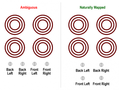
We all know how stoves work, cooking and making things on stoves everyday. Apparently; whoever designed the regular stove you and I use everyday, or at least you; is in fact a sadist. Knobs are linear, eyes (black stove heat circles or whatever that is) are arranged inside a rectangle, this made sense until I read The design of everyday things.
Some critics thought it’s “Unnecessarily complicated” and I have to agree to certain degree, the structure, or the hierarchy of sections would’ve been more intuitive, but still, this book is a game changer in my opinion.
I stop and look at the knobs to know which is which, every time, and never questioned the design, I blamed my lack of intelligence, which is a behaviour Norman talks about in the chapter “The knowledge in the head and in the world”
Affordances
“An affordance is a relationship between the properties of an object and the capabilities of the agent that determine just how the object could possibly be used.”
In other words, capitalize on the properties of the thing you’re building to make it seamless and intuitive by using the right element in the right place. In web design for instance, a button affords (is for) clicking, If that button doesn’t suggest that specific interactivity, that button is a disgrace and should be burnt with fire. People should be able to figure out how to use something only by looking at it. “When simple things need pictures, labels, or instructions, the design has failed.”
Mental Models
Mental models, as the name implies, are the conceptual models in people’s minds that represent their understanding of how things work.
Briefly, a mental model is a trend that is passed down by a vastly used product, and it’s not necessarily right. In our case at RBBI, it’s almost always a tech giant. For instance, when we design a mobile app, we tend to draw a fine line between innovation and following a mental model, then try to play around that area. Bottom dock or a hamburger menu? both are mental models, but with the paradox of technology, which is evolving, gigantic devices, I’d go for a dock.
Remember: “Technology changes rapidly, people change slowly”
2- Paper Prototyping: The Fast and Easy Way to Design and Refine User Interfaces- Carolyn Snyder
Paper prototyping is a variation of usability testing where representative users perform realistic tasks by interacting with a paper version of the interface that is manipulated by a person ‘playing computer,’ who doesn’t explain how the interface is intended to work. — Carolyn Snyder
If you’re already an expert in usability testing, you may not find this information as useful. I sure did back in the day when I used to muddle through, trying to figure out how to validate whatever ideas I had for a certain feature or a product.
Snyder came in like a wrecking ball; uprooting me out of the darkness like an infelicitous little tree. I remember walking in one morning with my iMac gone, and a pile of books instead, with a sticky note on top “Stop being a disgrace, love, CTO”
It took me a while to digest all of that stuff, and to be frank I didn’t buy all of it. Some parts felt ridiculous, as if pulled out of a fiction or some generic, happy, self help book which one cannot apply half of its teachings.
“Why would anyone start tapping on a piece of paper expecting it to move or animate, and how would anyone benefit from that exercise in the first place?”
These were my initial thoughts, until I conducted my first full fledged paper prototype, and the results were jaw dropping.
This book is all about:
- Creating a Paper Prototype
- Planning a Usability Study With a Paper Prototype
- Designing Tasks for a Usability Study
- Preparing and Refining a Paper Prototype
- Facilitating a Usability Test
- Conducting a Usability Study With a Paper Prototype
- Deciding Whether to Use a Paper Prototype
This uxmatters review of Paper prototyping would help you digest the highlights of this book quickly in light munches.
Remember:
Often, what users say they like does not reliably indicate what they can successfully use and vice versa. — Carolyn Snyder.
The above had an immense impact on my day to day design-feedback cycle, but you’ll also learn this in the background: Humility and how to connect with people, which is of utmost importance in our line of work. You’ll read about “The user who cried” somewhere in this book, which may or may not make you giggle a tiny bit, and maybe want to try whatever triggered the tears, for fun you know, whether or not you get sued, please don’t refer to this article and ask your lawyer to use it as plea, not gonna work.
3- Defensive Design for the Web: How to improve error messages, help, forms, and other crisis points — Matthew Linderman , Jason Fried
From the back cover:
Let’s admit it: Things will go wrong online. No matter how carefully you design a site, no matter how much testing you do, customers still encounter problems. So how do you handle these inevitable breakdowns? With defensive design. In this book, the experts at 37signals (whose clients include Microsoft, Qwest, Monster.com, and Clear Channel) will show you how.
Sadly though; not enough UX professionals care about that, until their marketing and financial teams get fed up with taking the blame for poor conversion rates.
Maybe your registration form is a long life story of a final fantasy fan fiction and it doesn’t show people what’s wrong with their entries. Maybe it’s built for 1880 stone tablets. Or with the infinite refund requests and legal issues because your form charges people every time they hit submit. The internet is built by humans and the machines that are used to run it are also made by humans, and humans make mistakes; lots of them, and connection stability and bug free systems are not exception.
Enough happy talk, or sad talk actually, I’ll just jump into major takeaways:
- Use colour, icons, and text to clearly highlight and explain the problem area.
- Don’t use language that might be unfamiliar to your customers.
- Eliminate unnecessary navigation during multi-step processes.
- Provide a human fallback plan (help via chat, phone, or email).
- Answer emails quickly and effectively.
- Highlight either required or optional fields.
- Assist form dropouts by saving information.
There is a full list here, but I’d say, go buy the book and read it. It is old, I agree, but most of what’s there is timeless, simply because it tackles issues that are rooted in human psychology.
A good example on how knowing these things beforehand would save you, and your organisation, time and money is a case study done by the one and only Eric Ries, author of The Lean Startup. This is not the first time I use this case study to showcase how UX design should work, It’s a huge amount of knowledge condensed into an article. In this example Ries talks about a product that suffered with conversions. One of it’s key takeaways says:
Don’t try to measure your way out of a problem. Metrics do a great job of telling you what your problem is, but only listening to and observing your users can tell you why they’re having trouble.
Here is a link to the case study where you’ll learn how a combination of experiments and usability tests solved their issue.
Conclusion
UX design is a timeless, ever growing field with all kinds of twists and turns. It is not exactly like many other professions where if you didn’t ride the wave you’re far behind, in this case, the wave is motionless, inside a Chronosphere, outside of the physical plane, inside humility and emotion. It’s nothing they can teach in school or can be acquired through a degree, read, keep reading and most importantly, look for a place where you are the worst in the pack.
That’s all folks, I’ll come back with part II with three other books that I’ve read years back, most of which I still go back to, for guidance, and to end arguments.