Jumbo Ecommerce
Breaking Norms in Ecommerce Design in the Middle East
For the last 40 years, Jumbo Electronics is known to set the benchmark for consumer electronics retail in the region. As part of the company’s pledge to “redefine” the regional shopping experience for consumer electronics online, Jumbo ventured in to offering a fully-integrated platform that serves consumers online and offline in a simplified process.
They found a capable technology platform / partner in Build-a-Bazaar and were
looking for a true UX agency.
Pitch and the Strategy
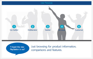
A strategy was part of our pitch to the team at Jumbo who were evaluating UX agencies to partner
with. As part of the pre-pitch “discovery phase” stakeholder workshops were conducted to
understand the vision, business requirements, primary insights collected by the team and data
vital to our next phase of strategy.
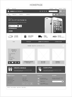
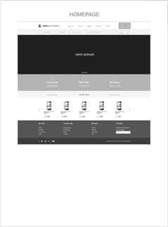
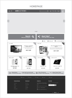
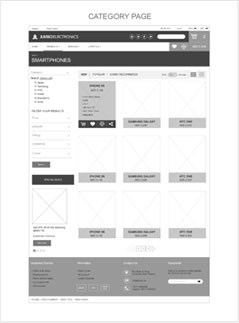
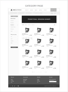
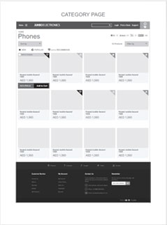
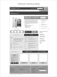
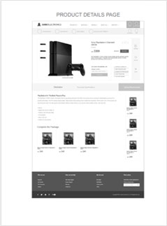
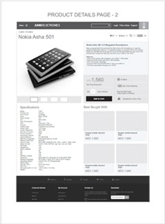
UX explorations and Wireframes
We challenged the fundamentals of regional ecommerce design patterns. We created
features, and experience that translates beautifully across all platforms and set the foundation for the
overall user experience. Every feature and user flow was challenged by the team as we started to put
together the overall navigation, structure and page structures.
Design and Design Again…
Designs are often done to please the client and management however, with Jumbo’s team we set out to
design for today’s user user that we had defined in our ‘discovery’ phase. Each detail of the design was
tested at our Usability Testing Lab by using Eye-tracking methods.
We wanted to make the content/product that users seek to consume as the hero of our design and not let
the design-decoration come in between the user and its goal.
Designing for the Users
One of the things that sets RBBi apart is our ongoing mission to design for users and not
the client’s team alone. It’s about trying to separate the subjectivity from the design. Ecommerce
design is about goals, it’s about users and it’s best if its validated by REAL USERS.
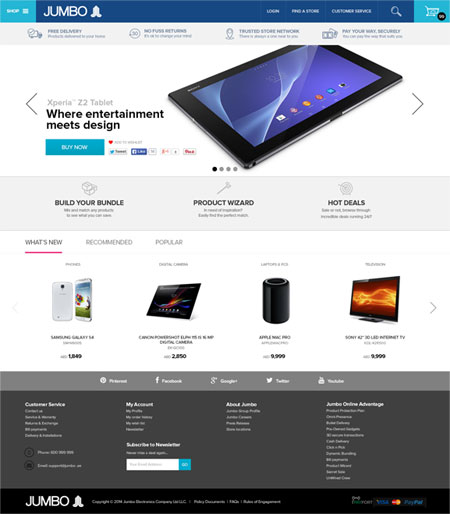
Homepage
Clutterfree homepage focused on the easing the mortar load on user’s mind.
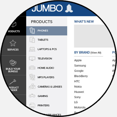
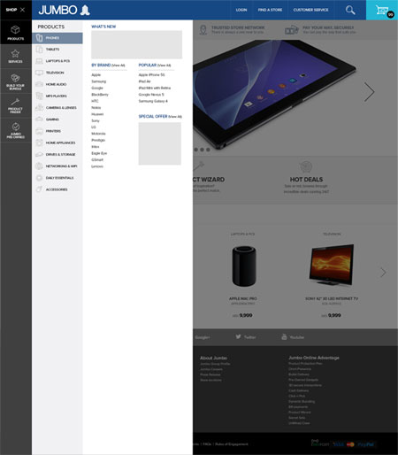
Side Navigation
Breaking the norms and matching it’s user behavioural
pattern a unique first-in-the-region side navigation was introduced
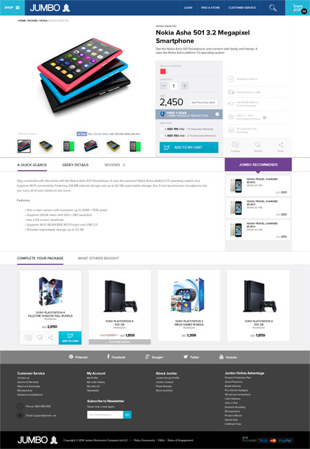
Product Details
The most important page where decisions happen. The
page was structured for maximum visibility, clarity and relevant content for decision
making.
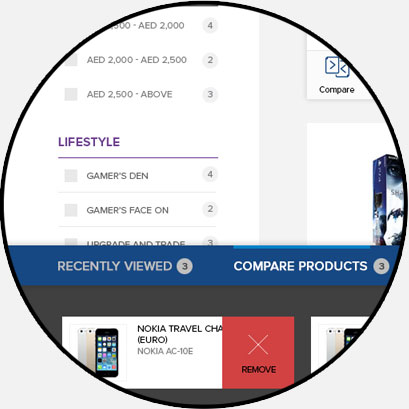
Discover by Lifestyle
As discovery came out to be the most important
challenge various Discovery aids were provided to the user
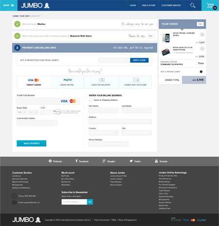
Single Page Checkout
Working with it’s payment partner RBBi designed a one
more first in the region – a single page checkout process.
Iconography
All icons used across the website were specially designed for relevance and quick
understanding of the affordance
A Conversation in every Communication
We wanted the shopping experience to be as seamless as possible compared to the offline
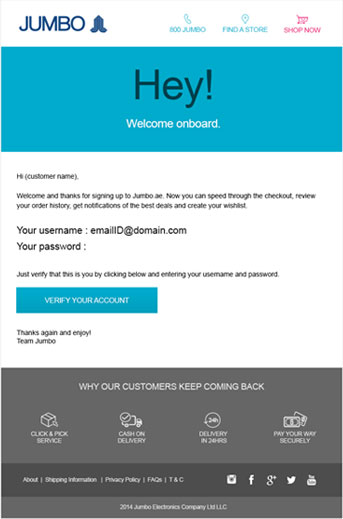
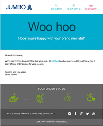
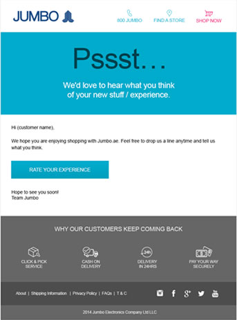
experience and thus every communication was an expression even the boring emailers we send.
