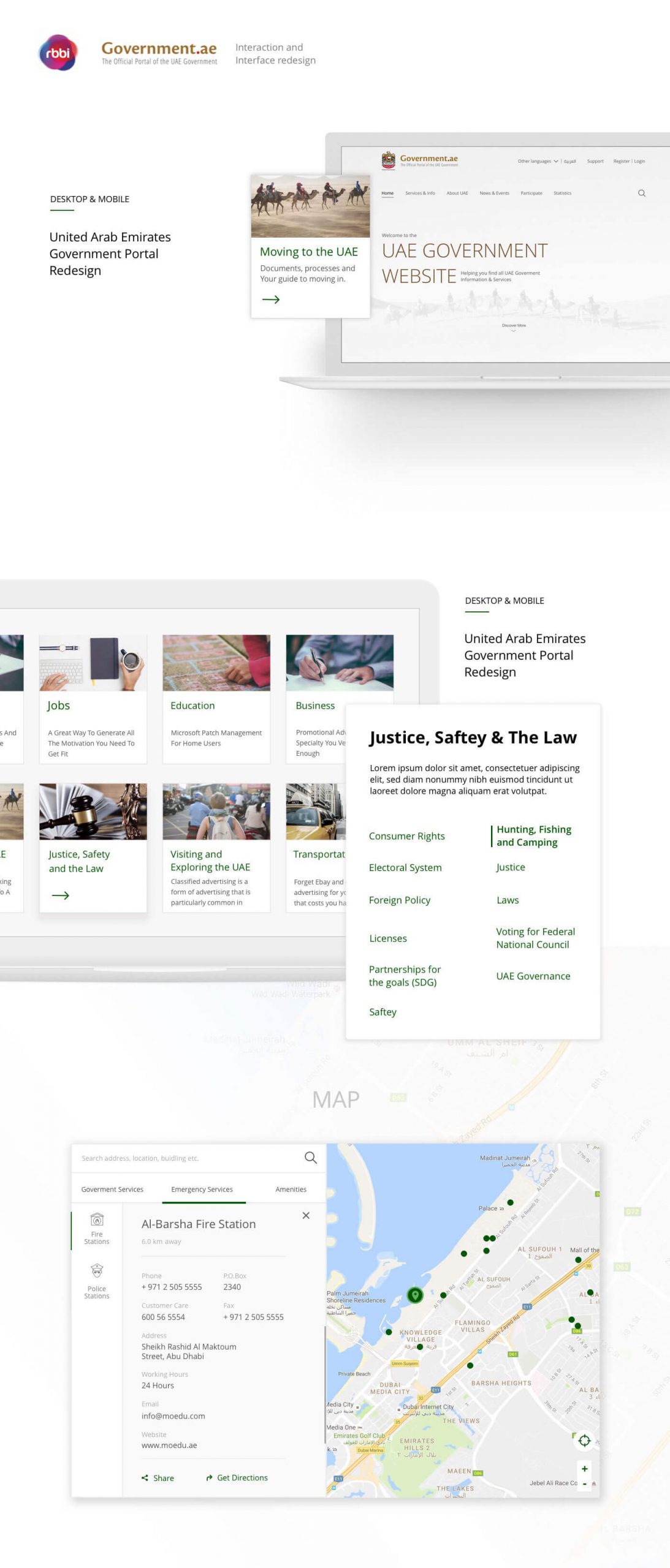
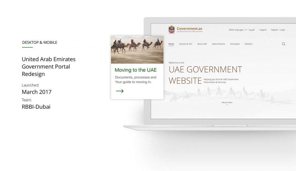
UAE Government Portal
Setting a Regional Standard
A digital transformation and an adventure into the depth of government portals.
“Our role as a government is to make the life of our citizens easier and
ensure they are happy and satisfied. We need to reach all the
community segments and provide them with the best possible
service“— His Highness Sheikh Mohammed bin Rashid Al Maktoum,
Vice-President, Prime Minister of the UAE and Ruler of Dubai.
Overview
The UAE government has always been an early adopter of recent technologies and innovative,
revolutionary concepts. Technology, automation, telecommunication and industrial science are at
the top of the vast list of areas the UAE government is always investing in.
Today, the UAE is a hub of a complex, diverse eco-system in which people from almost two
hundred nationalities reside and lead fast paced, achievement oriented lives. In an effort to help
make these achievements — along with personal growth — happen, and happen swiftly, the UAE
government took a step towards making mundane paper work and queuing at government a
thing from the past.
The Challenge
“We want to be the central hub for all government entities”
Maher Al Mulla
E-Government Operations Department
Catering to a variety of cultural backgrounds, nationalities and age groups is most of the times
daunting, and we know for a fact that building something from scratch is scary. You may or may
not break something that is working, or fix something that wasn’t broken. Qualitative research
and constant iterations early in the building process should be the main focus for any user
centered design firm or practitioner, it may sound like common sense but you wouldn’t believe
how tempting these things are to overlook.
Simply put, taking the guess work out of all the whats wheres, and hows of everything relating to
moving, visiting, working and investing in the country at any point in time was the goal of building
this portal.
The Six Sprint Stages of Building the Portal
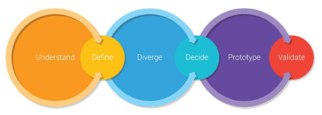
The Google Ventures Design Sprint
For Government.ae, we followed the Google Sprint Methodology. Pretty standard, on paper, but
when it comes to running a sprint with 30+ people split across UX designers, UX researchers,
developers and stakeholders; things can get complicated. This was the first time we’ve adapted
this methodology. Adjusting to a new way of working as a team was a challenge on its own.
Adapting the Sprint Methodology allowed us to streamline the UX process. For example,
iterations were clearly spread out across sprints, as well as user testing sessions in the research
phase. We had weekly catch-ups with the client in order to show our progress and we made sure
that there was something to show for as a deliverable after every Sprint was completed.
User Research
We worked side by side with the government team over the course of four
months to ensure both sides understand the users we’re creating a
portal for. A few weeks of user research revealed a lot. Every time we get into the room with
someone, they confirm or debunk assumptions we have already made.
We’ve set up an open ended questionnaire and posed probing questions to
representatives of various demographics: UAE nationals and expatriates from
countries all over the world.
Twenty open-ended user interview sessions and a dozen boxes of
pastries later…
Our questionnaire wasn’t specific. Qualitative research needs a fair amount of experience in the
psychology of design. Asking a user why until you get to the bottom of something they said or
brushing it off is the difference between mediocre and great user research. The takeaways from
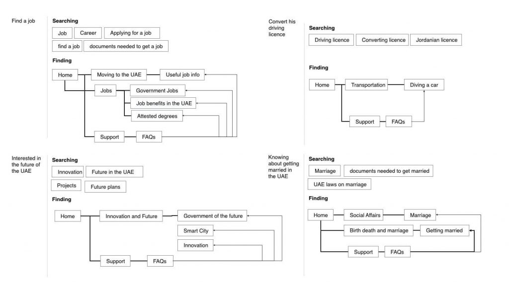
the user interviews allowed us to sketch out potential user journeys on the new portal.
Below a couple of examples of the initial user journeys:
Understanding the Requirements for the Portal
The business requirements were stated clearly at the start of the project: Arabic
first, translations into 50+languages need to be available, a mobile first approach
and AAA accessibility. These requirements turned out to overlap with our user
research findings during the questionnaire and therefore were at the top of the
list moving the project forward.
We audited the existing government portal and came up with items we could
keep and what items would be discarded based on our user testing sessions. We
listed what currently is working, and what doesn’t work:
The output of this exercise was the feature list. This list established whether
specific features for the portal — for example the location map- were usable, and
interactive, as well as other features such as the UAE history’s timeline and polls
where visitors of the portal can participate in decisions the government makes.
Wireframes
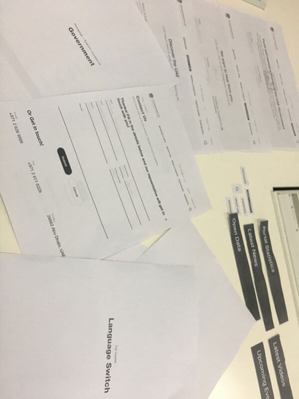
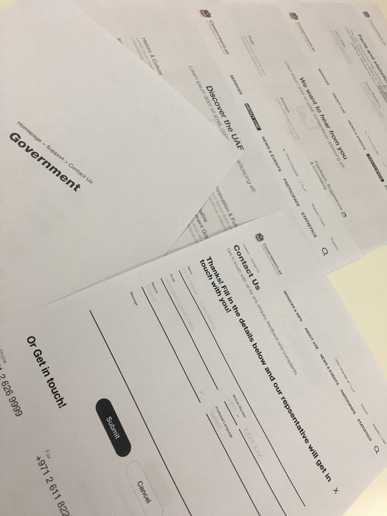
I was tempted to upload 500+ screens and modals, but this turned out to be quite a feat and would certainly negatively impact the length of this case study. Below are some snippets of the wireframes for the portal. We used the wireframes to do a very rapid paper prototyping user testing session to validate our structural decisions before we moved forward with testing digital prototypes.
Accessibility
The next topic we tackled is accessibility. How do you come close to a triple A accessibility rating
in line with the Web Content Accessibility Guidelines (WCAG)? the WCAG is a set of rules which
need to be followed in order to ensure your webpage is accessible to people with disabilities. It
was developed by a group of individuals from around the globe called “The Accessibility
Guidelines Working Group (AG WG) (formerly WCAG Working Group ), which is part of the World
Wide Web Consortium (W3C) Web Accessibility Initiative (WAI).” — (www.w3.org)
Making sure we achieve a triple A accessibility rating, we had to go through the W3C accessibility
principles and read all of them carefully (and there are a lot, trust me). The vast number of
guidelines were enough to push you out of your comfort zone as a user experience practitioner
and force you to cater to more than the researched user persona(s) or confirmed criteria.
Most of it may sound pretty standard, common sense, but I personally did not think I would need
to account for “content not to cause seizure” in any design process I’ve been involved with for
example.
A few things we needed to look at:
- Text alternatives for non-text content
- Functionality is available from a keyboard
- Users are helped to avoid and correct mistakes
- WCAG 2.0 color requirements
Examples of tools and practices which can assist in improving accessibility:
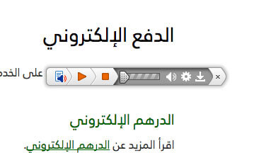
This tool ensures the reader can select a text to be read aloud
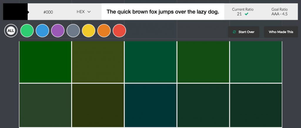
Contrast between background color and text — the higher the accessibility rating, the darker the tones for text
High transparency for backgrounds — along with the video on the homepage ensures improved readability when a background has an image
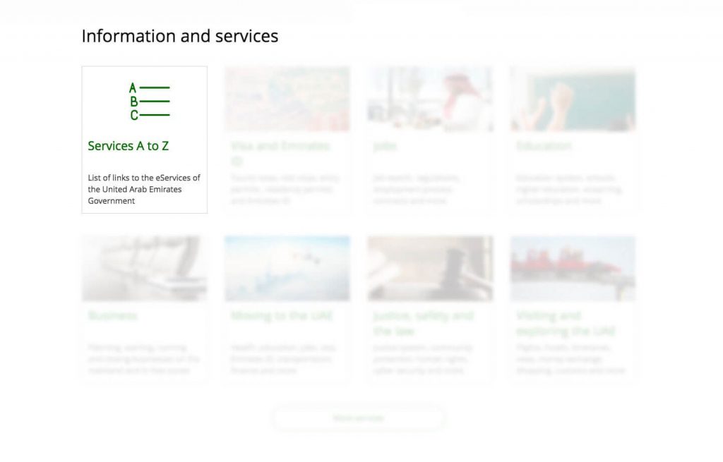
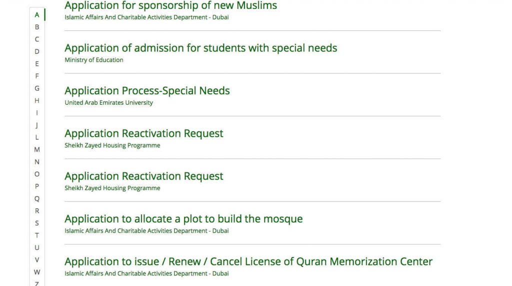
Feature Highlights from the new Government Portal
The Index
When you visit the portal for the first time, and you are to for example renew your driver’s license
you want to do this quickly and efficiently.
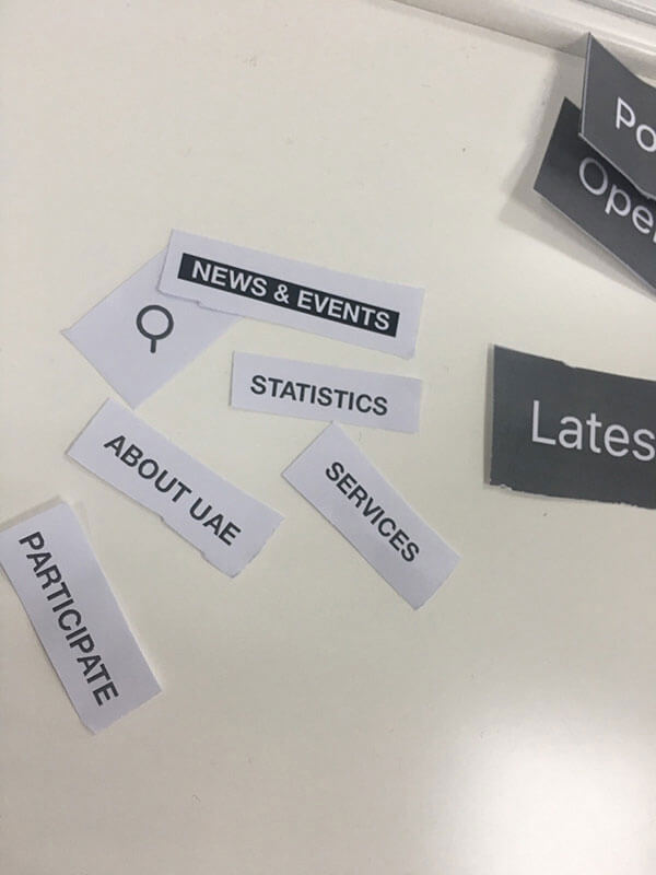
What you’ll need is the index. The index is built with an A-Z overview of all the services provided
by the government.
*The index and other features in the screenshots below are as per the launch date. The
features on the website are subject to change post-launch.
Languages
Given the vast number of nationalities this portal was built for, we wanted a quick and easy way to
make information accessible to everyone. Having the content translated professionally in 50+
languages wasn’t an option for the first release, and we were tempted to believe most of the
visitors will find their way around in English, but making assumptions kills innovation when it
comes to problem solving. Instead, we sought Google Translate as an added feature, next to the
Arabic and English language pages.
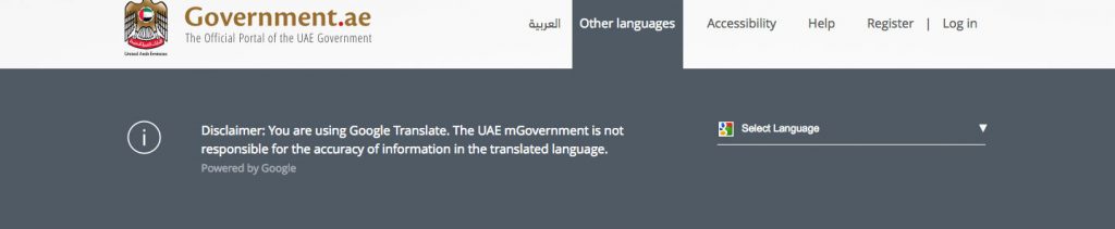
Google powered automation
This would have been a last resort if we were building this a few years back, but today, Google
Translate is extremely powerful and ensured easy access to the pages in more than 50
languages. We’ve provided character limits to make sure the interface doesn’t break or overlap
depending on how long text might be in a certain language.
I validated that by sending links with task(s) (figuring out what issuing a visa requires) to my
friends around the globe. Dutch, Indian and a few other languages, translation was at least 95%
right, All done, successfully with no issues, they said the translation was “seamless”
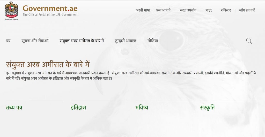
Example of a landing page in Hindi
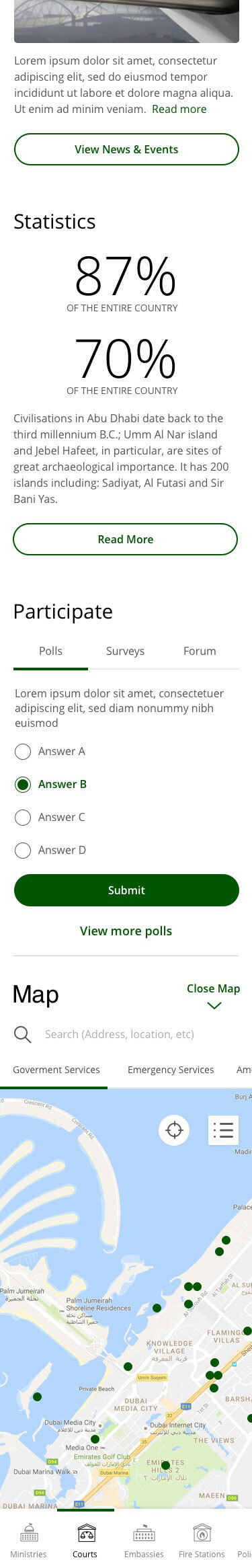
Interactive Map
Two of the challenges our user interview participants faced is finding out what ministry they need
to go to for a certain appointment and what the opening hours are.
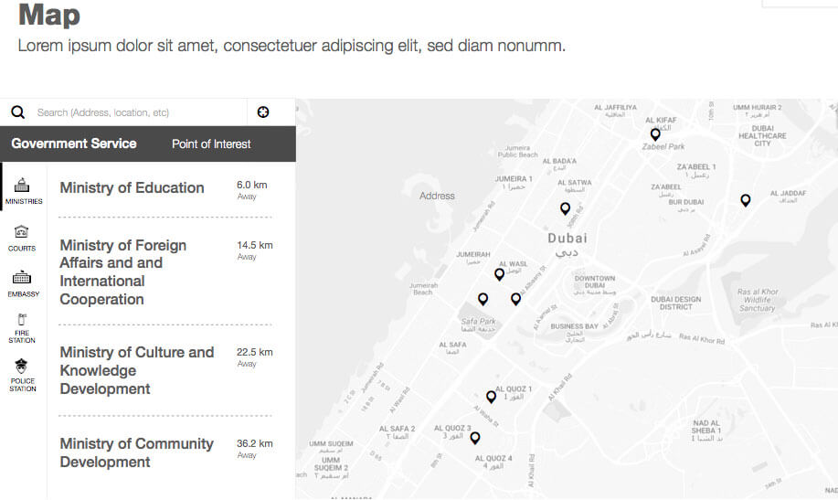
We initially wanted to show a map of the country, as informative as which emirate is where and
how many people live there. That was before user research. After looking into our user interview
findings, it had to be switched to an interactive and informative element, a map that shows you
government body locations like ministries, embassies, and police stations as well as points of
interest in the UAE, such as beaches and malls.
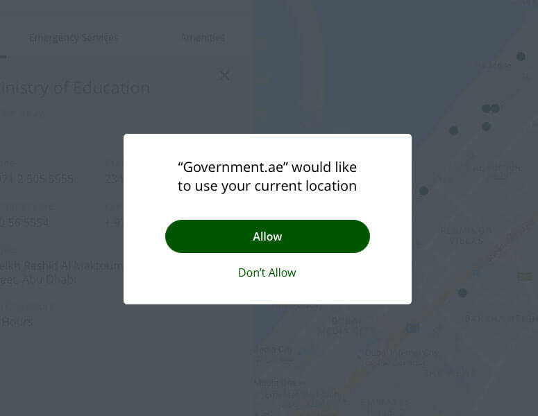
Making sure you get to the closest by detecting your location.
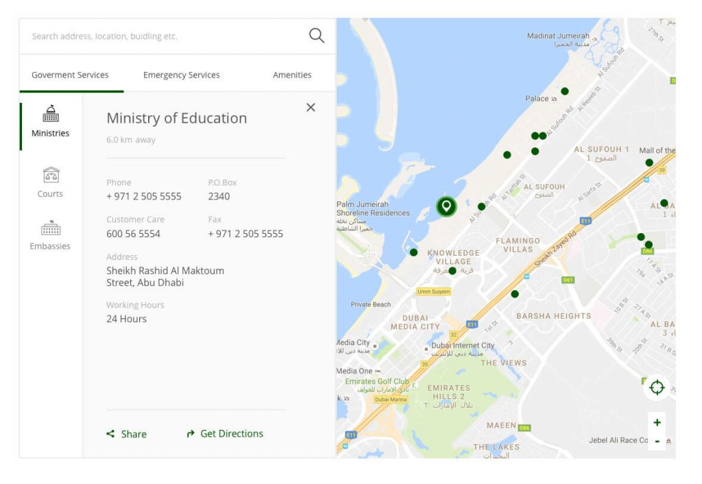
Address, opening hours and phone numbers are available on click
Mobile Interface
“In 2000, we became the
pioneers in theregion and the
seventh in the world to launch
the e-Government project.
Now we have taken a more
significant step by launching
m-Government,” Sheikh
Mohammed said.
Everything was built in mobile first, as users
predominantly visited the government portal
on their mobile devices.
Graceful Degradation vs.Progressive
Enhancement
A mobile first approach has an important
benefit.
According to the CMV Blog on
codemyviews.com:
“Graceful degradation arose out of a need to
have a design function on as many browsers
and platforms as possible. Designers and
developers wanted to take advantage of new
technology without excluding users with
setups that didn’t have support. The general
conclusion was to create and serve up the
best experience possible, and then account for
each possible degradation and ensure that
despite any shortcomings, the site would
remain functional.
In terms of mobile web design, this meant that
a full, standard website would scale back and
gradually remove content and features as the
viewport became smaller and the system
simpler (no Flash support, etc.).”
In our case, removing meant downgrading,
which is why we went on mobile first mode, it
allowed us to avoid having to remove features
due to lack of real estate on the screen.
Takeaways
Things I personally used to undermine as an experience practitioner is accessible design, there is more to it than voice reading paragraphs, having bigger text or an inverted colour blind mode, it is one of the fundamentals of designing for the web and there are many resources and examples to learn from.
Reflecting Diversity and Innovative Thinking
“The efforts spent in the UX lab [helped] address all users’ needs and
perceptions.”
Ragia Abdel Wahab
Senior Business Editor
The actual design work wasn’t the biggest challenge here, and it has never been on any other
project we’ve built at RBBi. Catering for such diversity while maintaining the spirit and the feel of
the country’s culture, as well as understanding the region specifics like climate, history, religion
and language requires harmonising your design approach to these.
Examples on that would be the tone of voice and the terminologies we used, specially in Arabic,
which was the main focus from a business side.
The following paragraph is an example of catering for the people of the country and the region,
the typeface choice along with the tone of voice, both convey strength, authenticity and authority.
We as a UX consultancy were lucky to partner and work with the UAE government officials to
make this portal happen, them being early adopters of the newest and most advanced solutions,
as well as their knowledge and experience in digital were key to achieving the first to many
scalable and widely accessible smart government portals.
A Snippet of the Final Product