Before I begin rambling on a subject many might not be aware of – take a step back and tell me: how many websites have you visited before landing on this article? Did you just check the updates on Facebook? Did you check out funny cat videos on YouTube while you’re supposed to be working? Now let’s say Facebook does not have a home feed and you had to manually click on all your friends’ names individually to see their updates. Or say, the YouTube video you’re watching doesn’t show suggestions of similar videos, so you have to browse through all pages within the search results, hoping one of the thumbnails has a similar cat video. Sounds tedious huh? Well fret not, the digital superheroes are here to save you from this fate. I’m referring to the UX (User Experience) professionals: people who follow a specific process to create user-friendly websites. If I were to explain in layman terms, these UX professionals follow the UX design process to ensure a website performs optimally by being user friendly, intuitive and useful, as well as enhancing conversions or increasing customer retention. In short, it should be “easy to use”. The UX design process consists of multiple phases, but for this article I will be concentrating on just one of these phases which is wireframing.
So, what is a Wireframe?
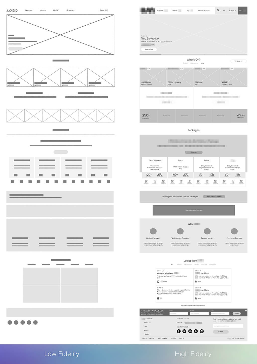
A wireframe can be defined as “an image or set of images which displays the functional elements of a website or page, typically used for planning a site’s structure and functionality” (Oxford Dictionary). To put it simply, a wireframe functions similar to a blueprint and shows how the structure of a website is dictated: what content is placed, where it is placed and how the user would interact with the page. Created in almost fifty shades of grey, website wireframes are designed using all the information gained during the research & discovery phase. The wireframe can either be a quick rough sketch or a high fidelity wireframe, but should meet certain guidelines to make sure they are user friendly such as Ten Usability Heuristics for User Interface Design by Nielson. Backed by actual data and created specifically keeping the user in mind, these grey and white images can either make or break the finalised product. Here’s the thought process behind creating these skeletal images we refer to as wireframes.
1. Decide on Content Modules and Hierarchy
First up, we create the content modules, which is a list of information and features the wireframe needs to include. The information within the content module depends on what the page is about, what its main purpose is as well as including crucial information gained during the research phase. Simultaneously we look at the content hierarchy : establishing what information is primary vs secondary. Essentially this involves making sure the most important content is upfront for the user. But before we dive into creating content modules backed by UX expertise – it always helps to take off the UX hat and just be a user. Although, a comment some experts may disagree with – I like to incorporate some personal experience into the process. For example, let’s say we’re creating a homepage wireframe for an airline website, I would think about my own personal experience – for instance “booking a ticket”. Like most, I have visited airline websites before – what features made my task easier? What content grabbed my attention? What made me decide to book on that site, or not if that as the case? Note “everything” down – any information is good information. Keeping these personal insights in mind, it’s time to put the UX hat back on and incorporate all the information you have learnt during the discovery phase.
2. Incorporate Research into Content Modules
Let’s assume we’ve established that the homepage’s main purpose is booking conversion – so a prominent booking widget is a must. Our focus group research revealed that users want to see flight offers upfront (Keep in mind it’s extremely crucial to involve the user from the very beginning whether it’s through focus groups or through one-to-one interviews). The personas and user journeys we created based on our research also helped us sympathise with the user needs and develop a flow from point of interaction to completion. Our research has also indicated user behaviour and expectations in terms of content the target audience would be seeking, and how they discover it. For example, a business class user would want to see business class fares up front whereas a traveler with a family may want to see destinations up front. As additional validation, the benchmark analysis has also dictated that many airline websites tend to have their booking widget above the fold within the page, so in combining all of your insights, you create the winning formula content module for the page.
3. Research Trends, Labels and Interactions.
Now its time to see how all this information can be translated into a visual structure? This is where benchmark analysis also helps – how have benchmark websites displayed their information on the homepage? Have most of the websites used the same structure? For example, a sticky navigation header – there is a reason why people switched to having sticky menus and others followed suit – it works. Similarly, you can look for trend inspirations: how have other websites represented their content – and you’re not constrained to same-industry websites, inspiration can come from multiple sources. Also your identified trends can be merged, for example, if one website displays flight offers in the form of thumbnails with basic info while another website displays the offers with more comprehensive information; is there a way of merging these together for a winning combination?
Similar to trends – labels and interactions can be researched. What labels have been used to segregate the different sections. What language is used? Is it conversational or straight to the point? For example, while one website would say “Latest Flights Offers” the other would have a “Deals for You” label. What makes more sense keeping in mind the region and potential users? Additionally, what interactions are used – hover, sliding cards, dropdowns? Introducing interactions which lead to discovering content, and validation and completion of tasks can help keep the user engaged, and ultimately turn a lead into a conversion.

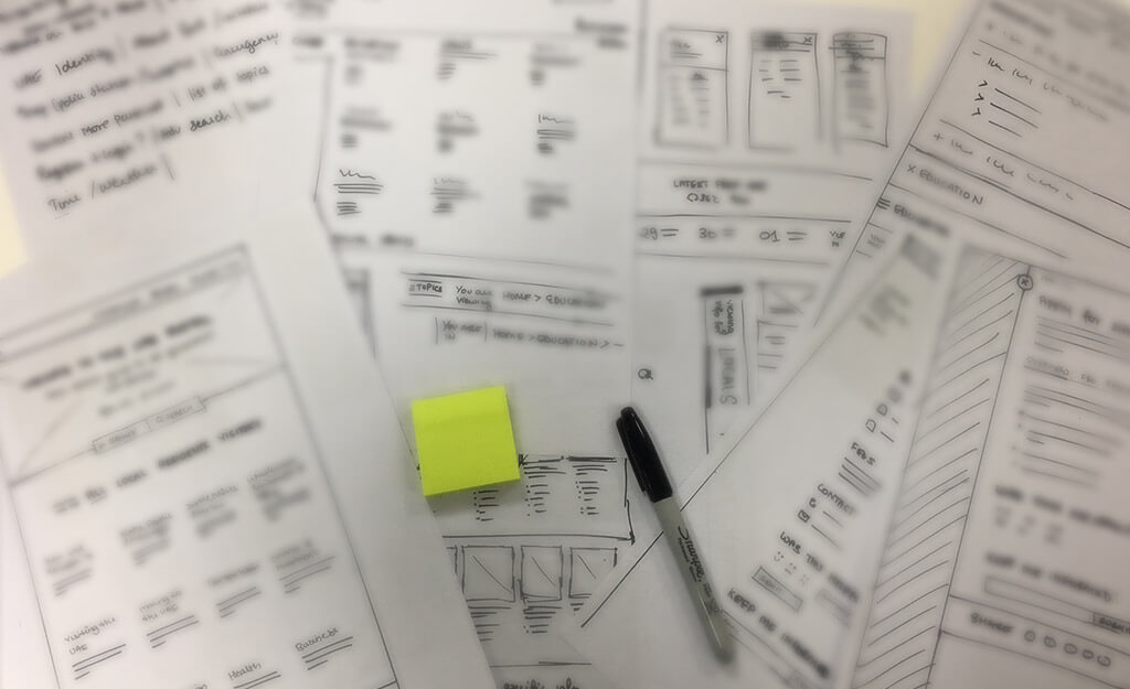
4. Sketch, sketch and sketch before using “Sketch”
Its time to grab a pencil and release your inner artist. I know the tempting feeling of going straight to a digital program but stay strong as you will most likely be wasting time otherwise. It’s a great feeling when turning some horrendous two-minute sketch into digital art. But resistance and persistence are the keys. Your sketch doesn’t need to be perfect, it’s about getting the basic concept right and thinking on your toes: quickly editing and tweaking along the way, and getting collaborative input to make sure your interface is right. Refinement and perfecting can happen when you finalise your wireframe in a digital programme. Moreover, making collaborative iterations in sketch-mode helps decrease changes when converting it into a high fidelity wireframe and the subsequent design stage.
5. Test out your Wireframes
Test it out with real users whether it’s during the sketching process through paper prototypes or while converting into high fidelity click-through wireframes. As crucial it is to involve the user before starting the wireframe through focus groups or one-to-one interviews – it is as important to do the same prior to finalising the wireframe. It doesn’t have to be a proper user testing session – grab your family or friends – test it out with them. Of course do make sure they are the ideal user – don’t just grab your five-year-old nephew and ask him to book a flight. Ideally, each wireframe should be thoroughly tested to see what improvements need to be made.
6. Keep it Consistent
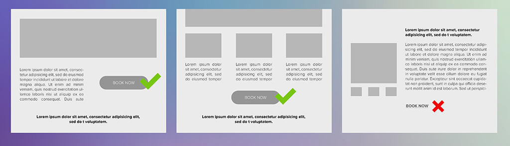
All your wireframes should be consistent in terms of the used modules, design of call to action (CTA) and labels – consistency is key in making sure you’re not giving the user much to think about when they’re completing their task. For example, let’s say a CTA such as Book Now is displayed as a button on one page while on another it’s displayed as a text link. It’s confusing to the user. In the user’s eyes they have associated Book Now with a certain visual representation. The aim is to ensure the user doesn’t hesitate when he or she sees the CTA. Consistency across these elements also conveys attention to detail, quality and helps instil trust when translated to the real thing.
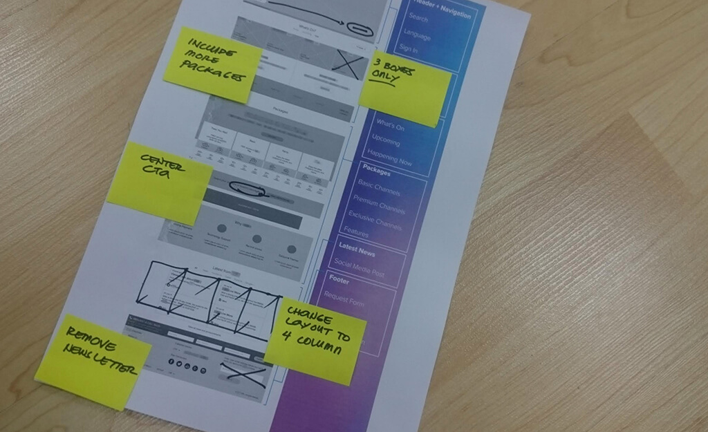
7. Do a Mini-audit
Once your wireframes are complete – do a bit of sanity check yourself. Go back to the Ten Heuristics – and test out your wireframe. Do a mini-audit, it doesn’t need to be detailed; you’re essentially correcting any minor things which were overlooked. Even better, give the wireframes to a team mate. As UX experts, there are certain things we need to make sure our finalised wireframes contain however, we all become artists when it comes to our work – it’s hard to find fault when you have worked tirelessly on something. By showing your work to someone else, they will be able to provide you with an unbiased critique and would have additional feedback you can incorporate before the final deliverable.
Wireframing is truly an integral aspect of the UX process. From putting yourself into the users’ shoes to relying on your UX knowledge – it’s making sure the merge of both worlds translates into something that will not only work but will also be remembered. The process enables you to not only make sure the clients and team are on the same page – but it also allows you to test it out with the target audience before deep diving into visual design. Functionality, interaction and content hierarchy are all important wireframe elements which need to be determined from the very beginning. Wireframing allows you the time to disregard visual aesthetics and jargon, and focuses on creating a website blueprint with usability at its core. So go ahead and start wireframing!